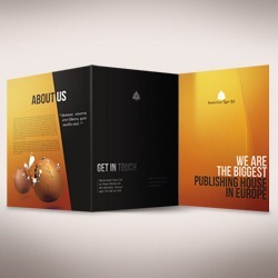
If you are beginner when it comes to print out things you can forget the headache while preparing document to print and leave behind all that weird-vector-things. With this tutorial you will be able to create a print-ready tri-fold brochure in nothing but Photoshop. The techniques shown here could be applied to any other printing documents as well, like flyers, business cards etc.
Step 1 - The concept
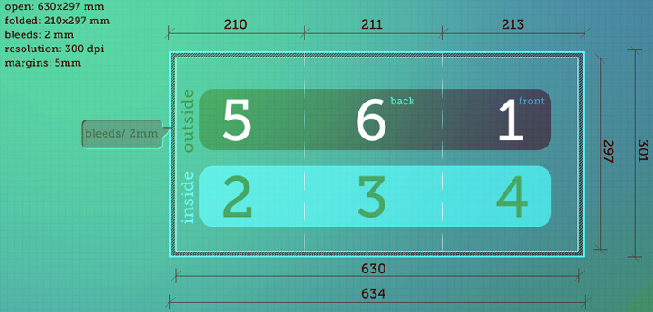
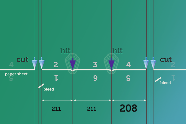
Every project needs some concept. At first, we have to plan out things to not get failed in the middle of design process. For now we need to determine the dimensions of the document. It is best to make a calculations with just pen and paper when you can easily and fast draw out shapes and values. I am making a brochure which after fold will be in dimension of A4 size. If you would like to use Letter size rather than European standards, then just check it's dimensions. It is best for me to work in millimeters. So, if you want to use inches instead, you will have to convert my values (Photoshop does it automatically). Actually, my sketch is one big doodle, so I decided to make a clean graphical show off of the concept. Don't care about this too much, just write down the values to not confuse yourself. The big numbers determine the placement of the single pages. Notice, that the front page is on the end of document while the back is in the middle. It could be confusing at first, but it's simply logical. You just have to imagine the print in your head. There are also paper sizes of real dimension and sizes with bleeds. Also, I will tell you that it is named C folding type.
Step 2 - Resolution
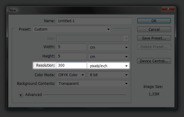
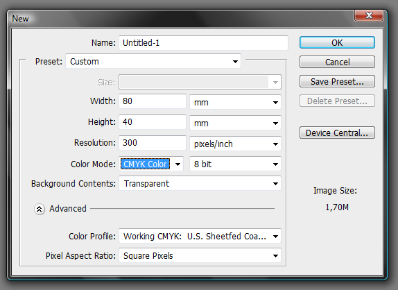
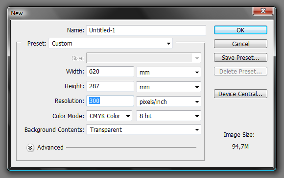
Resolution in print is the most important thing to take care of (aside design itself). While creating a new document you can set it here:
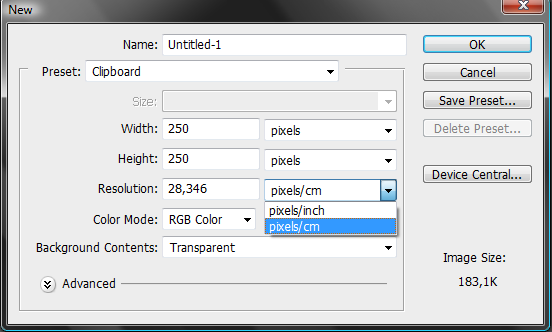
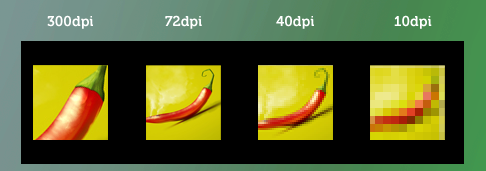
Printers shoots out the color dots on the paper. That's how printers usually works. And the DPI (dots per inch) is the value that determines the amount of those dots in one inch lenght. You can instead use DPCM (dots per cm) value, but I have never met the person nor the printing company that measures dimension in dpcm. Besides, it could be easily converted in Photoshop. While creating new document just type the value of 72 pixels/inch (It's actually PPI to be formal, not the DPI, but it's commonly named DPI), when you will change this to pixels/cm...
...the value will automatically switch to the 28,346. The same thing happens when you will change the size units (if you will change the pixels to cm/inches, the dpi value plays role here, just try out). While creating the images for computer screens like web, it is common tu use 72dpi value. Actually, dpi has nothing to do here, for screen images are only relevant to pixels and dpi will only affect its printing size; well, we could say that it is some kind of myth. The universal value for print is 300dpi. It's named the minimum for getting the sharp, nicely covered with color small prints (small means business cards, brochures, flyers, tickets etc). But it is not the value that is used all the time. As we are creating our A4 brochure which would be seen from the distance of our hands it is perfect. Some printing services suggest even 600dpi and more but it is quite officious. In the past I made a banner that was hanged on the wall and its resolution was 28dpi (If I would use 300dpi instead in this case I would crash my computer, for the size of the document could reach the horizontal or just split artwork into parts which is painfully and time consumable). As you can see 28dpi is very low value and if we had a piece of this banner in our hands we would see the print imperfections, however, from far distance (like street in this example) it was correctly sharp and crisp.
Once again, a short summary what dpi is. DPI specify the amount of dots which creates image's details. Dots are arranged in columns and rows. The horizontal and vertical amount of dots can vary, but I won't shake up your heads; besides it's just printing trick. Just remember- 300 DPI for print if you don't have other recommendation.
Step 3 - About the bleeds and margins
What bleeds really are? As you can see in step 1 our document is a bit oversized from what we want to have printed out. Just look what could happen without those bleeds and everything will be clear. At first I will get you through a short and bad story line:
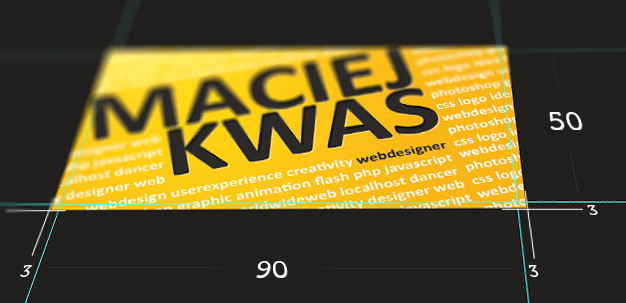
To the point- bleeds are those parts of design that will be cut out after print. They will fall out, notwithstanding sometimes batch is setted wrongly, by, let's say, 1 milimeter. If we would use the sizes of our business card as we set in bad example, we could get those white ugly stripes. But, if we extend our design by few milimeters, this cutting imperfection will be invisible. That's what bleeds are for. I have set bleeds of 2 mm in my brochure, however, the common bleeds size is 3mm. Those 2mm is just a preference of my printing service. Some accepts even 1 mm. If you don't know how big your bleeds should be, just assume they are 3 mm (0.125 inch) on each side. Sometime, when you have a white background of your document and any of the objects don't even touch the documents edge, there is no need for bleeds at all. But you have this in mind before you will start to design. Now, let's try to make a business card with bleeds. The size of 3,5x2 in corresponds to 89x51 mm and this is US standard (but also used in other countries). The standard size in Poland for business cards is 90x50 mm. Not a big difference, but I will use this second size to show calculations more clearly.
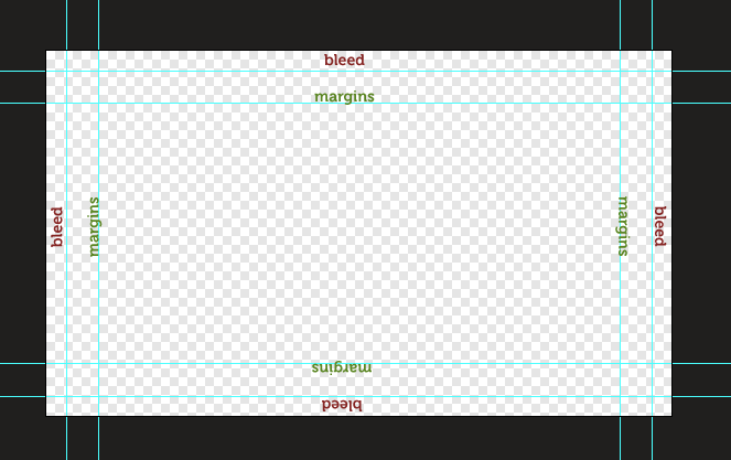
As you can see there is an extra 3 mm on each side of the document all around. So what dimensions you should type on? Here are calculations:
- Real size: 90 × 50 mm
- Bleed size: 3 mm
- Adding bleeds: 90+(3×2) × 50+(3×2)
- Document size: 96 × 56
Notice that while we add bleeds to the document we are multiplying bleed size by two. The reason is that the bleeds are on both sides. Don't miss that. The boundary of document is determined by the crop marks (they show where to cut the sheet, you can see some preview above in the 'bad example story line'). However, we can't do them automatically in Photoshop (as far, as I know). There is possibility of drawing them manually, but it's quite nonsense. It is super easy to import the document to illustrator and there bleeds are added automatically. If we don't have Adobe Illustrator nor InDesign, just tell the print worker that bleeds are seted to 3 mm and are determined by guidelines. It's second to add them (I will show how to do that later).
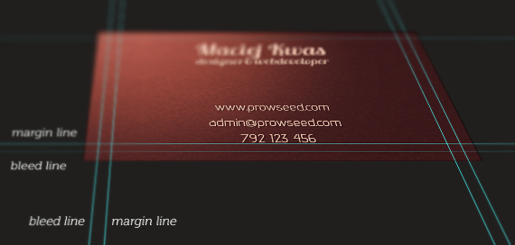
Now a little about margins. It is just a safety case. If without bleeds we have that 1mm white stripe, means, that on other side of the document 1 mm is cut out from the design. And if you don't want to have anything 'eaten' just place all your important things (like logo or text) in some distance from the edge. It is usually 5mm.
Step 4 - How to make bleeds and margins easy way
We will base on that business card template one more time. First of all- the concept. Our business card is 90 x 50 mm. We want to add guidelines that will determine the margins and bleeds. This is the fasten way that I know to add them. Also, it is good to make a sample file where you have all guides already placed. It is time saving- just opening the sample rather than making those guides again and again with every new project. Let's say our margins will have a size of 5mm, and bleeds- 3mm. Bleeds extends real size, while margins are inside the document. My next actions could be confusing, but focus yourself- you will save your time in future with this. Margins are on both side, so actually they affect 10mm of the document horizontally and vertically (and bleeds are 3mm on each side, so they affect 6mm). Now just get your real values (90x50) and delete from each the margin value (10x10). You will get the size of 80 x 40 mm. Create new Photoshop document with that size. From now, you don't have to calculate anything.
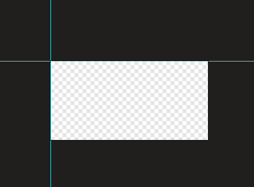
Now go to View > New Guide (twice time) and add horizontal and vertical guides with 0 px in input box.
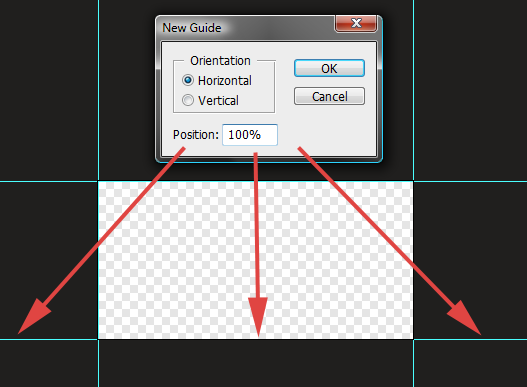
Duplicate this action, but instead of 0 px type in 100% (you can determine guides not only with pixels but also with centimeters, inches or percents). You will get the following:
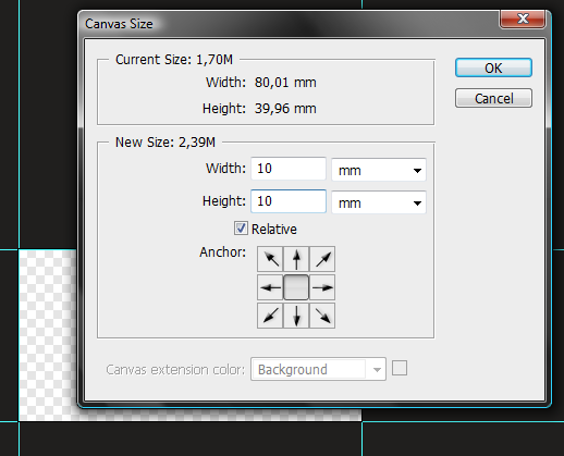
Then go to Image > Canvas size and type 10 milimeters in each field (because this is the size of margins). Make sure that Relative checkbox is checked.
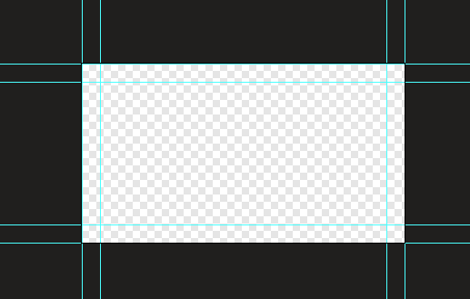
And again, add guides the same way. Here's a tip: You can record a guides adding process as a Photoshop action (for you don't have to type a specific values, just a beginning and end), so it will be even faster.
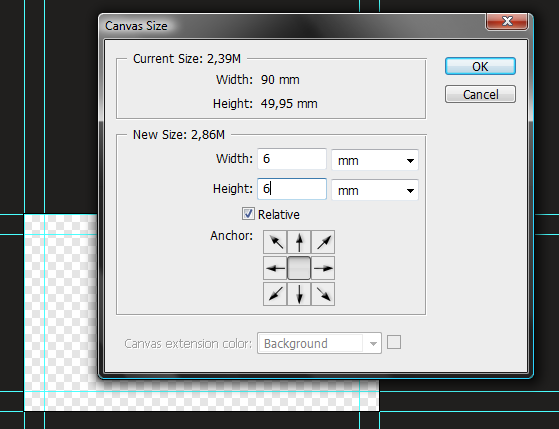
And at last go again to Image > Canvas size and type in boxes 6 milimeters, for this is the size of bleeds. As you can see the values are relative and always the same, and by that universal, so you can make a one huge Photoshop action to fasten this process.
Here, I have even prepared one for you. While playing this action you will get a dialog box four times. Just type100% in the input box and hit [Enter] each time. That's all. The easy process becomes even easier. Of course sometimes you will be asked to make bleeds of some other value than 3 mm, so you should also remember the process.
Margins&bleeds.atn | 1,5 KB
Step 5 - Stop that talk, start design!
All right, it is all for today's dirty work. Hopefully some of you have learned something. Now we can go straight to the design part. Do you remember what we are actually creating? I am scared that I confused you with that business card's talking. So we are making a tri-fold A4 brochure, here's the specs:
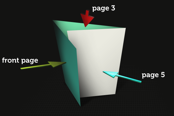
And here is a 3D concept to make it easier to understand by you.
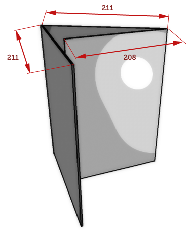
Have you noticed something? When you will leave bleeds you will get the following sizes of each pages: 208 / 211 / 211. Why this bold dimension vary from others? It is just folding aspect. The page that is shorter just need to hide itself inside the fold. And if its size would be 211 mm (as rest) it could not fit into the fold and make paper blobs on brochure. So by getting those two or three milimeters back you will avoid those potential troubles.
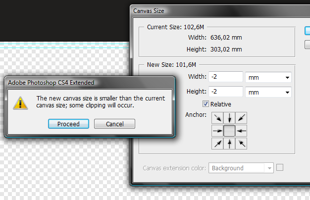
All right, we can start work from here, really. First of all- create new document with a real dimensions lowered by 10 mm from each axis (because of margins) - just follow the Step 4. My bleeds are equal to 2 mm, not a standard 3 mm. But actually I can run my action, and then just go to Image > Canvas size and type -2 mm (-1mm × 2) in each input field (remember about Relative checkbox).
Now we have to create some additional guidelines that will determine folds. Here's a trickery. We have to make different guides for inside and outside part of our brochure. Look at this sample guillotine work:
First of all, I will tell you how in Photoshop delete already made guides. It will help you if you will set them wrongly by a mistake. Ok, here's a magic- press [V] or choose move tool, click on a guide that you want to delete and drag it outside the document- it will disappear. If you want to rotate your guide by 90 degrees you can just press [Alt] and click in the point where guide should rotate. If you want to move guide by 10 pixels and it's multiplications do it while holding [Shift]. Now let's create our folding guides. Go to View > New Guide and type in 213mm in the input box. Repeat step, but with value of 424mm (213 + 211). Save the document as a inside.psd. Now delete both guidelines and add another two, but now type respectively 210mm and 421mm (210 + 211). Then go to File > Save as and save this document as outside.psd. Now we will start to work with this outside.psd document, and inside.psd will stay untouched as grid-only blank document for now.
Step 6 - Front page
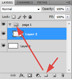
You can start from filling the whole document with white color. I have to do so, for I am always starting with transparent background. It is just my preference though. I don't like the auto-filling when I am playing with canvas size or so. You can use this type of brochure for your client work to display his offer, or just a product. I think that this destination is most often used. Also I saw some C-type brochures with CV/Resumes. I have to make some identity of fake company with its fake products and offer. Don't look at this, it is just for tutorial purpose, I won't advertise anything (at least not with intention). I will stay far from images for it is not universal to make absolute position of image. Of course I will provide some sample, but you have to decide by yourself where the given image fit perfectly. I will use my illustrations from drawing tutorials that you can find on this site elsewhere. It is good to make groups and organize layers.
With a rectangle marquee tool make a selection (guides are pretty helpful here) of the one third of the document that will determine the first page.
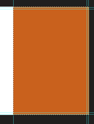
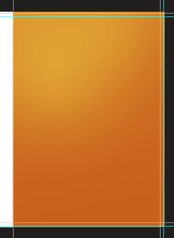
Then fill this selection with color #c96003. Actually, I should give you colors in CMYK for this is the color mode that we are working on, but, there are three cases why I wouldn't do so: first of all, it is not so important to use exactly same colors as mine; secondly, the CMYK palette couldn't be perfectly simulated on the computer screen (because the RGB system) so if you are looking for a specific color, you should use color palette from printing service or just print out few copies with different background color; finally, it is easier for you to just select a color and paste it into the hex value in color picker while CMYK values must be retyped. Now we will play with gradient tool, so our background will get some live. Our gradients should be attached as a clipping masks. To do a clipping mask move the cursor between layers in layer's window. Hold alt, and when cursor will change, left-click. Now the clipped layer won't extend the boundaries of the base layer. With the color similar to #e6b338 make few radial and linear gradients. My Opacity in the gradient tool is set to 30%. One thing: if you are using gradients for print, try to make them at least different by 5% in some CMYK value for it could be invisible or make a bounding.
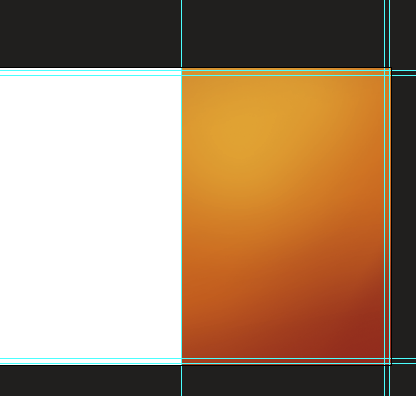
Now do the same, but with the color of #8d261c.
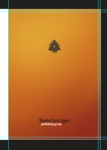
I have added my sample logo and fake company name, and trully, this would be the end of page 1 for me for I am minimalist.
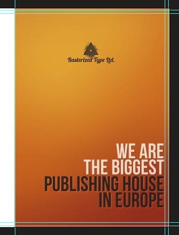
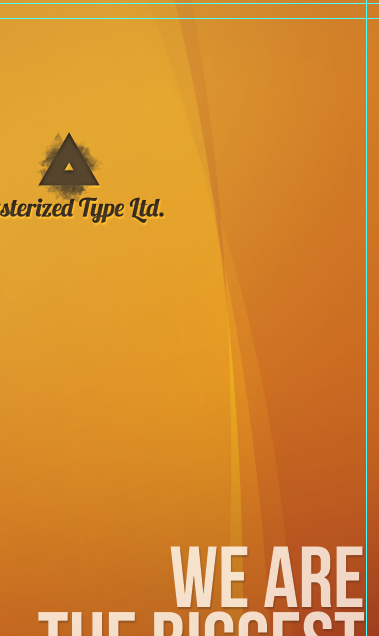
However, our clients mostly expects something else. I found this is very popular among certain groups of clients to put a huge tagline in the middle of the page to clarify the company mission. Let's try to meet this sample expectations and modify a bit our page. Here I have moved the logo on top and added huge tagline on the bottom.
Small and quick trick- get Elliptical marquee tool and make huge ellipse along the page.
Then with gradient tool (opacity of 30%) make two or three gradients with white color. At the end change gradient's layer opacity to Soft light or overlay.
Repeat this step two or three times. You can also try out with black color.
Don't get too far with your design aspirations. Brochures should be simple and informative. Also, avoid fancy backgrounds for your text could be hard to read.
Step 7 - Page 6
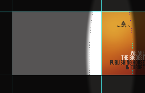
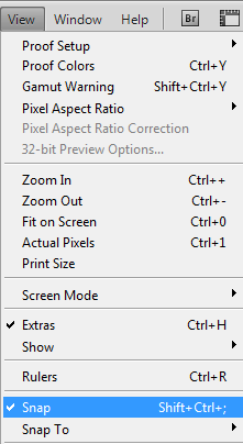
Back page- the perfect place for some map or contact info. All the tri-fold brochures that I have made in my life was in that concept. Occasionally there are some company photos. Just keep it simple. I think that for a lot of people it is intuitive to look for contact info on the last page. Make a selection in between our guides. Make sure that you have active snapping.
It will help you a lot in working with guides and in precise designing. Fill the layer with dark, grey color. Then add some text- that's it. I don't want to overload this page. Get advantage of Character panel and play with typography, for it is very important part in print design.
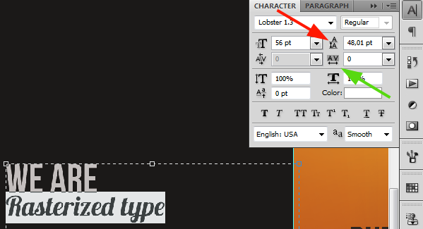
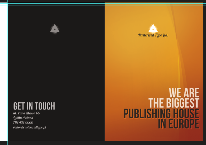
Under the red arrow you can set the leading of currently selected line (or lines). Under the green arrow you can modify the tracking of the characters (spacing between them). Sometimes you want to spread the whole text, just select it then and change tracking. These options are very useful, so play with them a bit for now. Below is the finished page.
Step 8 - Page 5
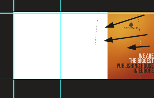
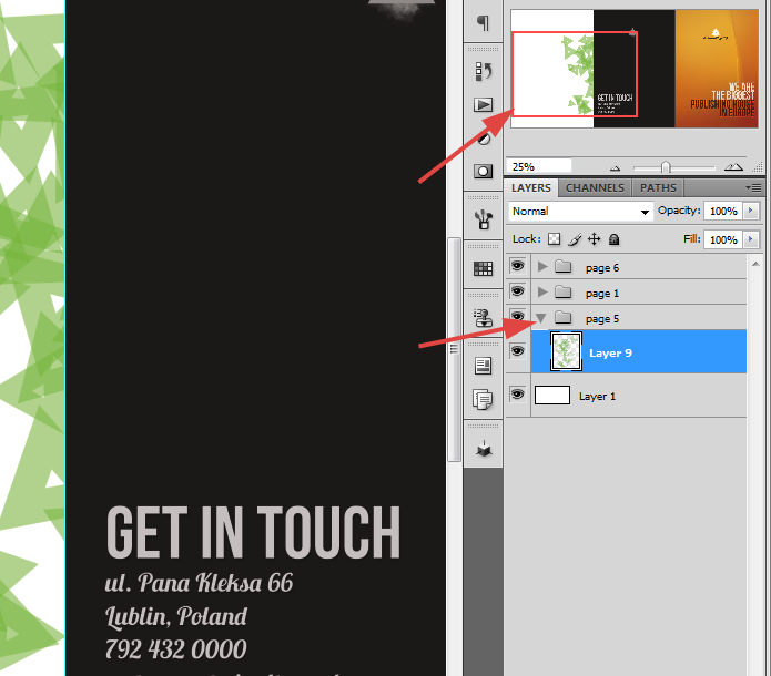
It is almost last page. However, this will be probably the first page that you will see while opening the brochure. It is good to place some company info here or connect its content with Page 2. In layer's window place this page set underneath page 6 and 1. Whatever you will place or draw on it, if it extend the page boundary, it will be covered with previously made backgrounds.
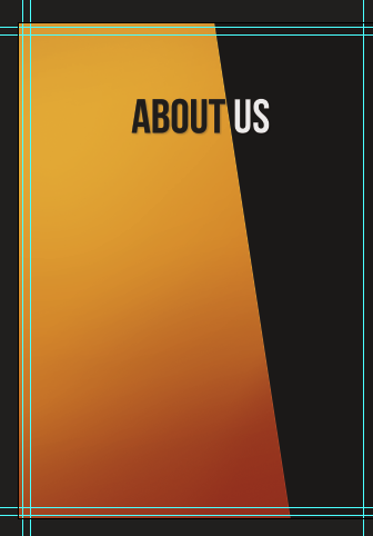
I've decided to put here about us page. Most often this section is on Page 2, while content on Page 5 is connected with Page 3 and 4. I think that this is confusing and for usability purpose I will connect 2,3 and 4 together while 5 will be separated. Also I changed a bit look of Page 6, but nothing really big at all. As the content is planned to be separated, thought we could make a connection of backgrounds. I am planning to make an orange background all inside the brochure. Fill the background with the same color that you have used on Page 6. Then make a selection, something like that:
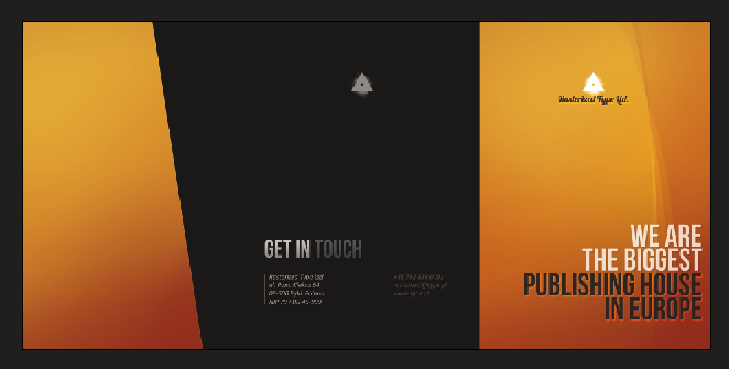
Style this selection as a front page. I mean- fill it with orange and add some gradients. Now the three pages look like this:
Make some heading. The point here is that I want to mix up two colors.
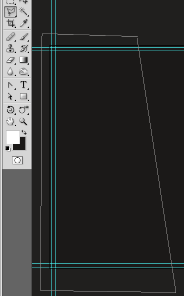
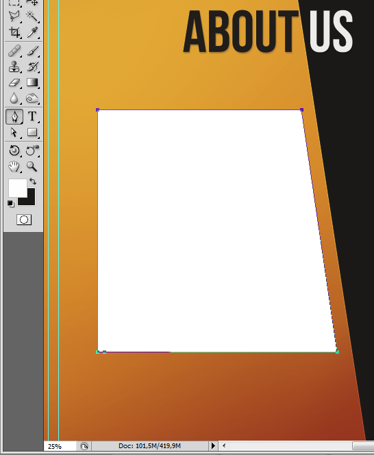
Now get the Pen tool and make a shape that will fit the orange area. Don't care about the color.
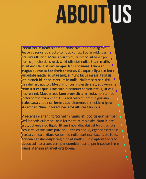
Pick the Type tool and move your mouse above the shape. Notice that the cursor has actually changed. If you will move it to the shape's border it will have additional line. After clicking you will have a possibility to write text around the shape. Inside the shape cursor will have an additional circle. After clicking your typing boundary will limit to the boundary of shape. So, click inside the shape- that's the place for 'about us' info. It could be shorten or longer- here I will enclose to the simple Lorem ipsum.
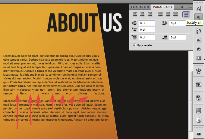
The mostly real preview of final print you will get with the zoom value of something like 33%. Have this in mind while you will try to choose the best font size. After the typing of text you can simply hide or delete our shape (actually, you can make just a path instead a shape, but I wanted to show it clearly). You can also justify the whole text to make it fit better to the shape, but then avoid huge spaces between text (You can instead use Justify last left/center/right).
Below text you can place some image, chart, offer, history line or so. It vary and depends mostly on client and your creativity.
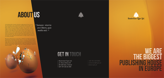
Few minutes and our outer part of brochure is ready. Just save it and close for now. Later I will show you how to save this document for print and how to prepare a simple mock-ups.
Step 9 - Pages: 2, 3 and 4
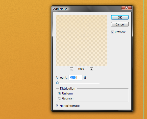
Open up earlier prepared inside.psd file. Here we will create the whole content within one breath. I don't want pay too much attention to the design and content for it is really, really dependant on client and brochure's purpose. Thus I won't describe every little action for it is quite nonsense, just main things and tips. All right, fill all of the documents area with orange color and style it with gradients as before we did with Page 1 and 5. It is also a good idea to add just a bit of noise to the gradients. Thanks to this you will avoid the color bounding.
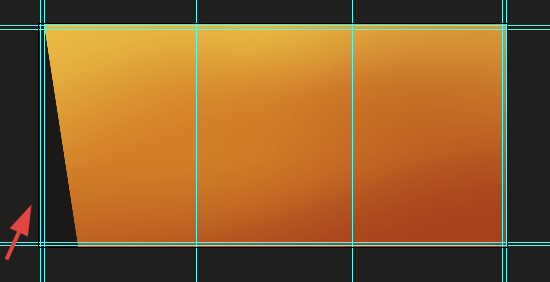
Also I have added a small shape so thanks to this design will fit to the Page 5. You will see it clearly on the Mock-ups.
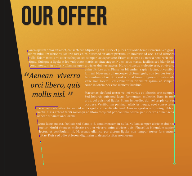
You can enhance your text by wrapping it around the quote or image. It is just a case of custom shape.
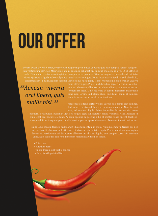
Also remember about the thing, that the brochure will be watched from closer distance (probably) than your computer screen. Just try by yourself. My monitor is on the lenght of my arm plus about 15 centimeters. To holding the brochure I have to bend elbows, so it is much more closer. If you think that you have typed too small font size maybe try to print out some sample on your local printer. It is very possible that the text will actually be in perfect size for reading. Here goes the Page 2.
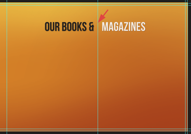
Our content on Pages 3 and 4 will be connected. I have made a heading for both pages. Notice the spacing hovered with red arrow. Try to keep your letters far from folds because they will be harder to read.
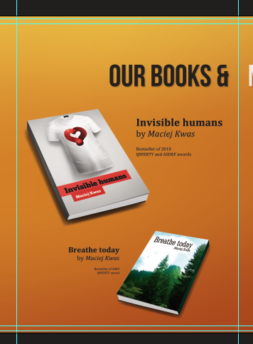
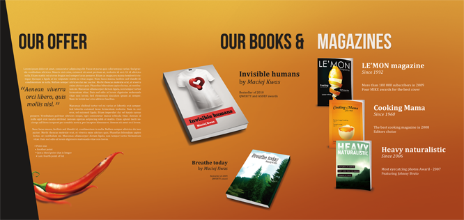
On the Page 3 I will place two book's mock-ups. My work here is quite pointless so I am doing just a simple tasks. Yup, I know- "Breathe today" would be for some Arabic.
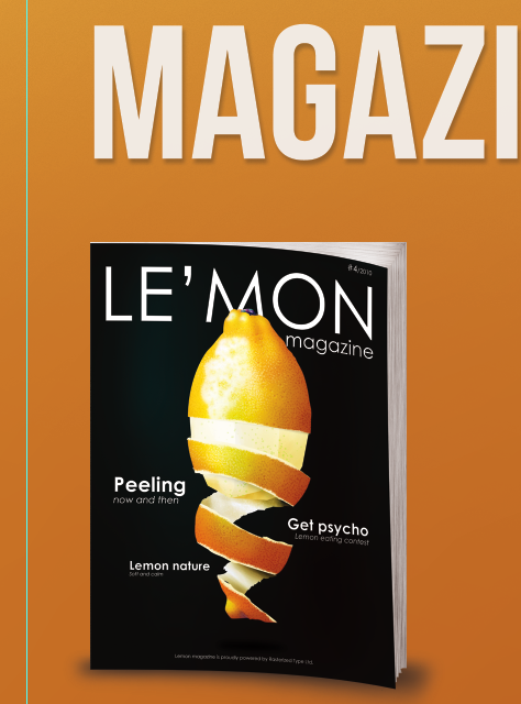
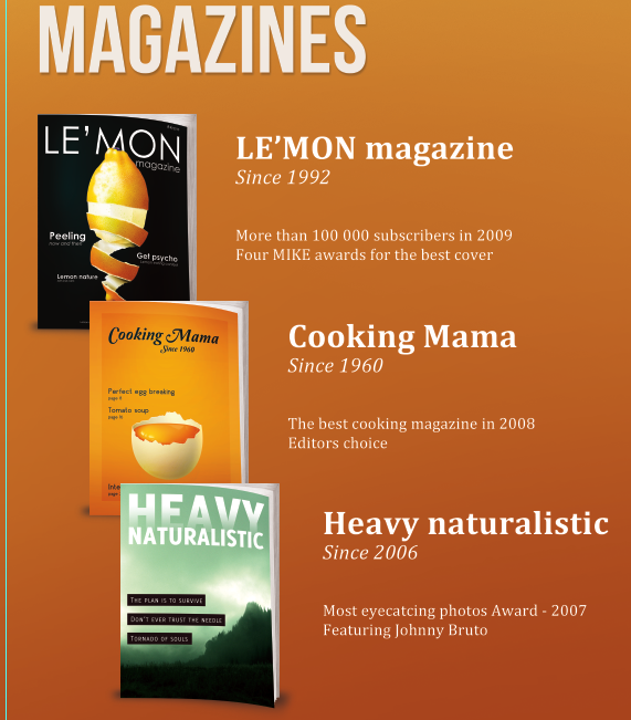
Just another simple mock-up template for magazines.
And a full spread:
Step 10 - Get ready for the Mock-ups
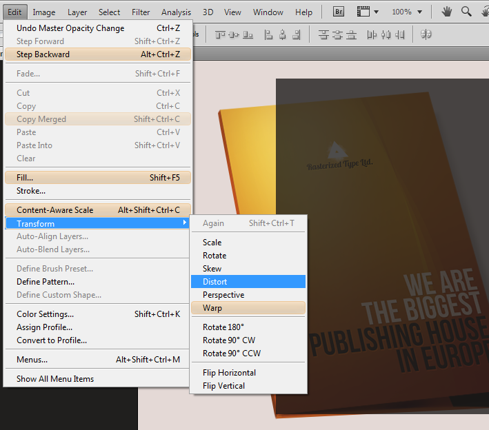
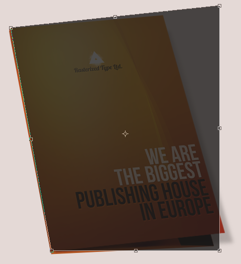
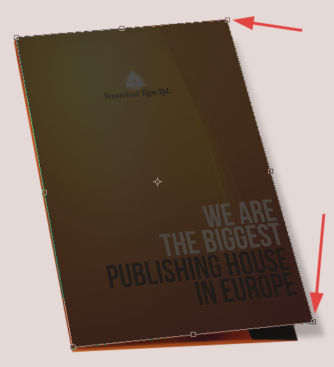
There's a time when you would like to present your work to the client. However, it is rather a bad idea to send him just the preview of two files (inside and outside). For sure he will feel a bit confused. Your client don't have to know anything about print, but he would like to see some mock-up before he will spend his money. It's a best way for both sides. Let's try to make some mock-up. My mock-up is pretty small because of the limit in width of the website. Try to make your mock-ups bigger, just a bit smaller from the real size (in between 20% and 30% of actual dimensions). You can actually use my mockups. There's nothing more than a Distort transformation (Well, just a little bit warp on the boundaries). Just place your design above mine, go to Edit > Transform > Distort and try to fit the shape. You can even resize my file for here the quality isn't important, just follow the shape.
Try to make mock-ups for all the pages and if you think you can handle this, prepare some 3d view. If it will help you anyhow, you can download my mock-up psd file.
mockup.zip | 3 MB
Step 11 - Saving for print
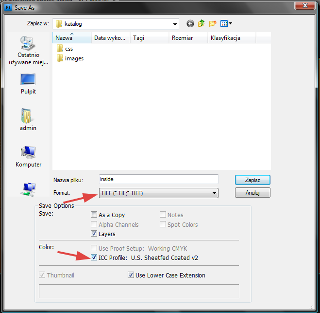
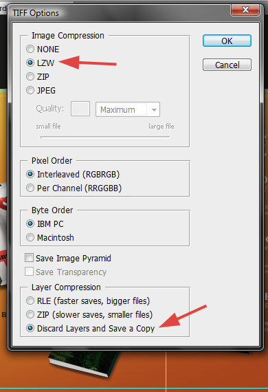
The best thing is to have a contact with a printing service. I don't actually have to specially save files for my printing company accepts my psd files. However not always you can send files that weight 2GB and more- it is just technically hard if you can't just jump into their office. But actually there are compressions that will allow you to save the files without quality loss (mostly). First of all, you can save the document as a TIFF file with LZW compression turned on. Sometimes you may be asked to not attach the ICC profile to the document:
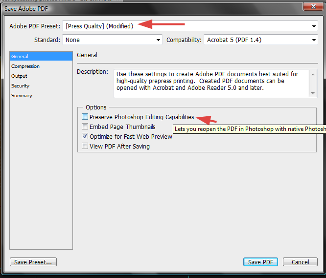
I'm quite sure that most of printing services will accept a file saved in this way. While the PSD file weight 250 MB, the tiff without mostly any quality loss weight only 26 MB (without layer). It is much easier to send that file away. Consider, that maybe you will be asked to make some changes inside the document. The second way to save the file is PDF with press quality. Choose your quality on top of the box. Also uncheck the option that will allow you (or others) to edit the file (do otherwise, if the printer will ask you for it).
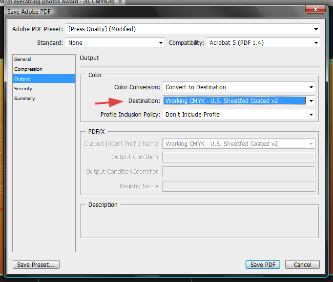
Make sure that you correctly choose the destination (hovered - a printing standard). Ask for it your printing service.
And... That's all. You are ready now to create a print-ready brochure from beginning to end. Hopefully this will help you to work with printing purpose files. Moreover- you are able to correctly prepare such things like business cards, invitations, flyers and so on. Just stick to the rules. Thank you.

![step-001[1] step-001[1]](http://photoshoptutorials.ws/images/stories/398442762450_BAFA/step-0011.png)

![final-results[1] final-results[1]](http://photoshoptutorials.ws/images/stories/398442762450_BAFA/final-results1.png)
No comments:
Post a Comment